How my page changes over the time
I’m not sure where this will fit yet, so for now, I’ll just leave it here.
Here’s a little log — in GIF clips — showing how my site has evolved over time, viewed from my iPad. Basically, it’s me trying (and struggling) to make it look good on both desktop and smaller screens.
Because of the nature of my work, I already spend most of my days staring at a PC screen from morning till night (well, I’m a film editor). To add to that, at night, before bed, I have this habit of reading webtoons on my phone to fall asleep. And when I do have free time, I end up using it to learn how to code — so, even more screen time.
That’s why I’ve been wanting to shift my coding to the iPad. Well, yes — another screen… but at least I can lie down while hobbying. That’s the point!
It’s been tricky, though; there aren’t many tools out there that really make it easy. Still, I want my site to look right on both phone and tablet, so I’ve been pushing through.
These clips are screen recordings of my site at different stages — from its inception, and they’ll be updated along the way. Because I’m learning and experimenting, I’ve been trying to save all the old HTML files for archive’s sake — but apparently, I’m doing a poor job of it. I keep jumping into new ideas too fast and forget to back things up properly. So, screen recording it is — my way of keeping a little visual record of the exciting mess and progress both.
November 04, 2025 - an experiment on cursors design and how to fake a custom cursor IMG on iPad

November 03, 2025 - tried out silly ideas for gallerying
November 02, 2025 - a conversation with AI

November 01, 2025 - as is (new gallery)

October 30, 2025 - home page

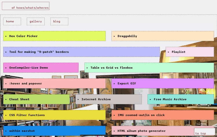
October 30, 2025 - this page, internet trinkets
October 22, 2025 - gallery


Draggabilly
✅ 1. Include the script
Place this before the closing </body> tag (or in <head> with defer):
That loads the library from the CDN.
✅ 2. Add an element to drag
For example:
width: 150px;
height: 150px;
background: lightcoral;
position: absolute;
top: 100px;
left: 100px;
cursor: grab;">
Drag me
</div>
✅ 3. Initialize Draggabilly with JavaScript
Right after you include the script, add this:
// Select the element
var elem = document.querySelector('.draggable');
// Make it draggable
var draggie = new Draggabilly(elem);
// Optional: listen for drag events
draggie.on('dragMove', function(event, pointer, moveVector) {
console.log('Element moved by', moveVector.x, moveVector.y);
});
</script>
Cursor Hotspot Notes
- Hotspot = click point inside your image.
- Coordinates start at (0,0) = top-left corner.
- Image size (e.g. 64×64 px) → hotspot can be any pixel in that grid.
- CSS syntax:
cursor: url("cursor.png") x y, auto;
→ x = horizontal offset, y = vertical offset from top-left.
Examples:
| Cursor type | Recommended hotspot | CSS example |
|---|---|---|
| Normal arrow | Tip of arrow (top-left) | cursor: url("arrow.png") 0 0, auto; |
| Crosshair | Center | cursor: url("cross.png") 32 32, crosshair; |
| Hand pointer | Tip of index finger | cursor: url("hand.png") 10 5, pointer; |
| Circle blob | Exact center | cursor: url("circle.png") 32 32, auto; |
- To find hotspot → mark crosshair in editor, count pixels, test, adjust.
- Remove mark before exporting final .png.
- Test on real webpage — tweak x/y until clicking feels natural.
OneCompiler-Live Demo
This page is a live code editor. It lets you write HTML, CSS, and JavaScript
all in one place and see the results instantly.
Key features:
- Real-time preview of your code output
- Supports all standard HTML, CSS, and JS functionality
- Quick testing and prototyping for web pages
- No installation required — works entirely in the browser
- Easy to embed in other pages via
<iframe>
Color Picker
Table vs Grid vs Flexbox
Each layout method in CSS serves a different purpose. Here's a simple overview:
1️⃣ Table Layout
✅ Best for tabular data — when your content is structured in rows and columns (like spreadsheets).
<tr><th>Name</th><th>Age</th></tr>
<tr><td>Alice</td><td>24</td></tr>
<tr><td>Bob</td><td>30</td></tr>
</table>
- 📐 Rigid structure (rows × columns)
- 🚫 Harder to make responsive
- ✅ Great for data tables, reports, stats
2️⃣ CSS Grid
✅ Best for full-page or 2D layouts — allows you to control both rows and columns together.
<div>1</div>
<div>2</div>
<div>3</div>
</div>
<style>
.grid {
display: grid;
grid-template-columns: repeat(3, 1fr);
gap: 10px;
}
</style>
In CSS Grid, fr stands for “fraction of available space”. It’s a flexible unit that distributes space proportionally among grid tracks (columns or rows).
grid-template-columns: 1fr 2fr 1fr;
- The available width is split into 1 + 2 + 1 = 4 fractions.
- column → 1/4 of available space
- column → 2/4 (half) of available space
- Third column → 1/4 of available space
- 🎯 Perfect control over 2D layouts (rows + columns)
- 🧩 Great for galleries, dashboards, complex designs
- ⚡ Clean, modern, and powerful for full-page structures
3️⃣ Flexbox
✅ Best for 1D layouts — arranges elements along one direction (row or column).
<div>Item 1</div>
<div>Item 2</div>
<div>Item 3</div>
</div>
<style>
.flex-box {
display: flex;
justify-content: space-around;
align-items: center;
}
</style>
- ↔ Aligns items in one direction (row or column)
- 🔄 Auto-adjusts space and order easily
- ✅ Ideal for nav bars, toolbars, cards, small sections
🧠 Quick Summary
| Feature | Table | Grid | Flexbox |
|---|---|---|---|
| Main Use | Data display | Full layouts | Component layouts |
| Structure | Rows + Columns | 2D (Rows + Columns) | 1D (Row or Column) |
| Flexibility | Low | High | High |
| Responsive Design | ❌ Hard | ✅ Easy | ✅ Easy |
| Best For | Reports, data | Complex layouts | Menus, cards, sections |
:hover and popover
🎯 CSS :hover & popover Explained
In CSS, :hover and popover let you create
interactive elements — from simple hover effects to native pop-ups that don’t need JavaScript.
1. The :hover Pseudo-Class
The :hover selector targets an element when the user’s pointer hovers over it.
It’s great for buttons, links, and image transitions.
color: tomato;
text-decoration: underline;
}
button:hover {
background-color: gold;
transform: scale(1.05);
transition: all 0.2s ease;
}
Common properties used with :hover:
color/background-color– change text or background colortransform– scale, rotate, or move elementsbox-shadow/filter– add glow or blur effectscursor– change pointer style (e.g.pointer,help)opacity– fade in/out on hovertransition– smooth animation between states
2. The popover Attribute (New CSS Popover API)
The Popover API lets you show and hide lightweight pop-ups without JavaScript libraries.
You can attach a popover to any element with the popover attribute.
<div id="info" popover>
Hello! I am a popover! 🎈
</div>
How it works:
popover— Marks the element as a popover (hidden by default).popovertarget="id"— Links a trigger element to a popover by ID.popovertargetaction— Defines what the trigger does.
="toggle|show|hide"
Popover Types:
popover="auto"— Default behavior, closes when user clicks outside.popover="manual"— You control show/hide with JS (showPopover(),hidePopover()).
pop.showPopover(); // show manually
pop.hidePopover(); // hide manually
Styling popovers:
background: #222;
color: white;
padding: 1em;
border-radius: 8px;
box-shadow: 0 4px 12px rgba(0,0,0,0.4);
}
✨ Summary Table
| Feature | Description | Example |
|---|---|---|
:hover |
Triggers when pointer is over an element | button:hover { color: red; } |
popover |
Defines element as a native popup (HTML attribute) | <div popover>Hi!</div> |
popovertarget |
Connects button to a popover by ID | <button popovertarget="info"> |
popovertargetaction |
Controls action (toggle, show, hide) |
popovertargetaction="toggle" |
Export GIF
To export a GIF from Photoshop, press Ctrl + Shift + Alt + S (Windows) or Cmd + Shift + Option + S (Mac) to open the Save for Web dialog.
- Color Table / Algorithm: Perceptual, MacOS, or Windows — determines how colors are mapped.
- Number of Colors: 32–256. Fewer colors = smaller file, more dithered look.
- Dither: Controls color blending.
- Diffusion: Randomized blending, smoother transitions.
- Pattern: Repeats a fixed pattern, may look blocky.
- Noise: Adds grainy texture for stylized effect.
- No Dither: Hard color boundaries, sharp edges.
- Web Snap: Snaps colors to nearest web-safe palette; reduces minor variations for lighter file.

Cheat Sheet
Internet Archive
archive.org
Free Music Archive
FMA
CSS Filter Functions
| Filter | Example | Description | Typical Range |
|---|---|---|---|
blur() |
blur(5px) |
Adds Gaussian blur (softer look). | 0px → no blur, higher = blurrier |
brightness() |
brightness(1.2) |
Adjusts overall lightness. | 1 = normal, <1 darker, >1 brighter |
contrast() |
contrast(0.8) |
Adjusts contrast between light/dark. | 1 = normal, <1 muted, >1 stronger |
grayscale() |
grayscale(0.5) |
Converts toward black & white. | 0 = normal, 1 = full grayscale |
hue-rotate() |
hue-rotate(180deg) |
Rotates all colors on the color wheel. | degrees (0deg–360deg) |
invert() |
invert(1) |
Inverts colors (light↔dark). | 0 = normal, 1 = fully inverted |
opacity() |
opacity(0.5) |
Makes element more transparent. | 1 = opaque, 0 = invisible |
saturate() |
saturate(2) |
Intensifies or dulls colors. | 1 = normal, <1 = desaturated, >1 = vivid |
sepia() |
sepia(0.8) |
Adds brownish vintage tone. | 0 = none, 1 = full sepia |
drop-shadow() |
drop-shadow(4px 4px 10px rgba(0,0,0,0.5)) |
Adds shadow to non-rectangular elements (like PNGs). | Offsets + blur + color |
-
💤 Muted dark theme look
filter: brightness(0.8) contrast(0.9) grayscale(0.3); -
📸 Retro film vibe
filter: sepia(0.6) saturate(1.4) contrast(1.2); -
🌈 Cool neon effect
filter: hue-rotate(220deg) brightness(1.3) saturate(1.5); -
🌘 Soft Dark (gentle inversion)
filter: invert(1) hue-rotate(180deg) brightness(0.9) contrast(0.9); -
🎬 Cinematic Noir
filter: grayscale(0.5) contrast(1.2) brightness(0.8); -
🌙 Deep Night
filter: invert(1) hue-rotate(180deg) brightness(0.8) contrast(0.85) saturate(0.6); -
🌆 Warm Dusk
filter: invert(1) hue-rotate(160deg) brightness(0.9) contrast(0.9) sepia(0.3); -
🧊 Cool Midnight
filter: invert(1) hue-rotate(200deg) brightness(0.85) saturate(1.2); -
🎞️ Vintage Grey
filter: grayscale(0.8) sepia(0.2) brightness(0.9) contrast(0.95); -
⚡ Minimal Fade
filter: brightness(0.9) contrast(0.9) grayscale(0.3);
IMG zoomed-in on click
On click, it clones the image into an overlay (so the original stays).
Overlay covers the screen, dims background, shows large version.
Clicking overlay or the background closes it.
Like this:

CSS and JS
<style>
img {
cursor: zoom-in;
transition: transform 0.3s ease;
position: relative;
z-index: 1;
}
.zoom-overlay {
display: none;
position: fixed;
inset: 0;
background: rgba(0,0,0,0.6);
justify-content: center;
align-items: center;
z-index: 1000;
}
.zoom-overlay img {
max-width: 90vw;
max-height: 90vh;
cursor: zoom-out;
}
</style>
<script>
document.addEventListener("DOMContentLoaded", () => {
const overlay = document.createElement("div");
overlay.className = "zoom-overlay";
overlay.addEventListener("click", () => overlay.style.display = "none");
document.body.appendChild(overlay);
document.querySelectorAll("img").forEach(img => {
img.addEventListener("click", () => {
const clone = img.cloneNode();
overlay.innerHTML = "";
overlay.appendChild(clone);
overlay.style.display = "flex";
});
});
});
</script>
within earshot
HTML album photo generator
HTML
<!DOCTYPE html>
<html lang="en">
<head>
<meta charset="UTF-8">
<title>Photo Album HTML Generator with Folder Prefix</title>
<style>
body {
font-family: sans-serif;
max-width: 700px;
margin: 40px auto;
background: #111;
color: #eee;
padding: 20px;
}
h1 { text-align: center; }
input[type="file"] { margin: 1em 0; }
input#folder { width: 100%; padding: 6px; margin-bottom: 10px; }
button {
background: #0f0;
color: #000;
border: none;
padding: 10px 20px;
font-weight: bold;
border-radius: 6px;
cursor: pointer;
}
button:hover { background: #9f0; }
textarea {
width: 100%;
height: 300px;
margin-top: 10px;
background: #222;
color: #0f0;
font-family: monospace;
padding: 10px;
border-radius: 8px;
border: 1px solid #444;
}
.note { font-size: 0.9em; color: #aaa; }
</style>
</head>
<body>
<h1>🖼️ Photo Album HTML Generator</h1>
<p>Folder prefix (replace "./" with your parent folder path):</p>
<input type="text" id="folder" placeholder="./high-tech/" value="./">
<p>Drag & drop or select your images:</p>
<input type="file" id="files" accept="image/*" multiple>
<button id="generate">Generate HTML</button>
<textarea id="output" readonly placeholder="Generated HTML will appear here"></textarea>
<script>
document.getElementById("generate").addEventListener("click", async () => {
const files = [...document.getElementById("files").files];
if (!files.length) {
alert("Please select or drag some images first!");
return;
}
const folderPrefix = document.getElementById("folder").value.trim();
let html = "";
for (const file of files) {
const src = URL.createObjectURL(file);
const dimensions = await new Promise(resolve => {
const img = new Image();
img.onload = () => resolve({ width: img.naturalWidth, height: img.naturalHeight });
img.onerror = () => resolve({ width: "auto", height: "auto" });
img.src = src;
});
html += `
<img src="${folderPrefix}${file.name}" alt="x" loading="lazy" />
\n`;
URL.revokeObjectURL(src);
}
document.getElementById("output").value = html;
});
</script>
</body>
</html>
Plain-text → HTML Generator
stacking background
source code
<div id="container">
<section id="one">one</section>
<section id="two">two</section>
<section id="three">threeeee</section>
<section id="four">and so on</section>
</div>
<!-- CSS below -->
<style>
html, body {
margin: 0;
padding: 0;
}
#container {
position: relative;
width: 100%;
}
.section-content, section {
height: 100vh;
display: flex;
align-items: center;
flex-direction: column;
}
section {
overflow: hidden;
min-height: 100vh;
justify-content: center;
}
#container, section {
position: relative;
width: 100%;
}
#one { background-image: url("https://sadhost.neocities.org/images/tiles/pastelblue.png"); }
#two { background-image: url("https://sadhost.neocities.org/images/tiles/water.png"); }
#three { background-image: url("https://sadhost.neocities.org/images/tiles/butterflysparkle.gif"); }
#four { background-image: url("https://sadhost.neocities.org/images/tiles/bubbles.gif"); }
section { font-size: 120px; }
</style>
</body>
Code → HTML paragraph Generator
source code
<!-- Code → HTML <p> generator -->
<div id="code-to-p" style="max-width:900px;margin:20px auto;font-family:system-ui,monospace;">
<h3 style="margin:0 0 8px;">Code → HTML <p> generator</h3>
<p style="margin:0 0 12px;color:#666;">
Paste your code/text, then click <strong>Generate</strong>. Output will be an HTML-safe <p> snippet
with indentation preserved (leading spaces → &nbsp;) and lines broken with <br> so you can paste it into a blog.
</p>
<textarea id="sourceCode" placeholder="Paste code here..." style="width:100%;height:160px;padding:10px;border:1px solid #ccc;border-radius:6px;font-family:monospace;box-sizing:border-box;"></textarea>
<div style="display:flex;gap:8px;margin-top:8px;">
<button id="generateBtn" style="padding:8px 12px;border-radius:6px;border:1px solid #444;background:#111;color:#fff;cursor:pointer;">
Generate <p>
</button>
<button id="copyBtn" style="padding:8px 12px;border-radius:6px;border:1px solid #444;background:#eee;color:#000;cursor:pointer;">
Copy output
</button>
<label style="margin-left:auto;align-self:center;color:#444;font-size:0.9em;">
<input type="checkbox" id="usePre" style="margin-right:6px;"> Use <pre> (alternative)
</label>
</div>
<h4 style="margin:12px 0 6px;">Generated HTML (paste into your blog)</h4>
<textarea id="outputHtml" readonly style="width:100%;height:180px;padding:10px;border:1px solid #ccc;border-radius:6px;font-family:monospace;box-sizing:border-box;"></textarea>
<h4 style="margin:12px 0 6px;">Live preview</h4>
<div id="preview" style="min-height:60px;padding:12px;border-radius:6px;border:1px dashed #ccc;background:#fafafa;white-space:normal;"></div>
</div>
<script>
// Escape HTML entities
function escapeHTML(str) {
return str.replace(/&/g, '&')
.replace(/</g, '<')
.replace(/>/g, '>')
.replace(/"/g, '"')
.replace(/'/g, ''');
}
// Convert leading spaces/tabs to
function preserveIndent(line) {
// Convert tabs to 4 spaces first
line = line.replace(/\t/g, ' ');
const match = line.match(/^(\s*)/);
const leading = match ? match[1].length : 0;
if (leading === 0) return escapeHTML(line);
return ' '.repeat(leading) + escapeHTML(line.slice(leading));
}
function generateParagraphFromCode(code, usePre = false) {
const lines = code.split(/\r?\n/);
if (usePre) {
// simpler: escape and wrap in <pre><code>...</code></pre>
return '<pre><code>' + escapeHTML(code) + '</code></pre>';
}
const converted = lines.map(line => preserveIndent(line)).join('<br>\n');
return '<p>' + converted + '</p>';
}
// UI wiring
const source = document.getElementById('sourceCode');
const btn = document.getElementById('generateBtn');
const out = document.getElementById('outputHtml');
const preview = document.getElementById('preview');
const copyBtn = document.getElementById('copyBtn');
const usePreCheckbox = document.getElementById('usePre');
function update() {
const usePre = usePreCheckbox.checked;
const html = generateParagraphFromCode(source.value || '', usePre);
out.value = html;
// Set preview innerHTML so user can see how it will look
preview.innerHTML = html;
}
btn.addEventListener('click', update);
// Also allow live preview as user types
source.addEventListener('input', () => {
// small debounce
clearTimeout(source._t);
source._t = setTimeout(update, 200);
});
usePreCheckbox.addEventListener('change', update);
copyBtn.addEventListener('click', () => {
out.select();
out.setSelectionRange(0, 999999);
try {
document.execCommand('copy');
copyBtn.textContent = 'Copied!';
setTimeout(() => copyBtn.textContent = 'Copy output', 1200);
} catch (e) {
// fallback
navigator.clipboard?.writeText(out.value).then(() => {
copyBtn.textContent = 'Copied!';
setTimeout(() => copyBtn.textContent = 'Copy output', 1200);
}).catch(() => alert('Copy failed — select and copy manually.'));
}
});
// initialize
update();
</script>